
Brand design.
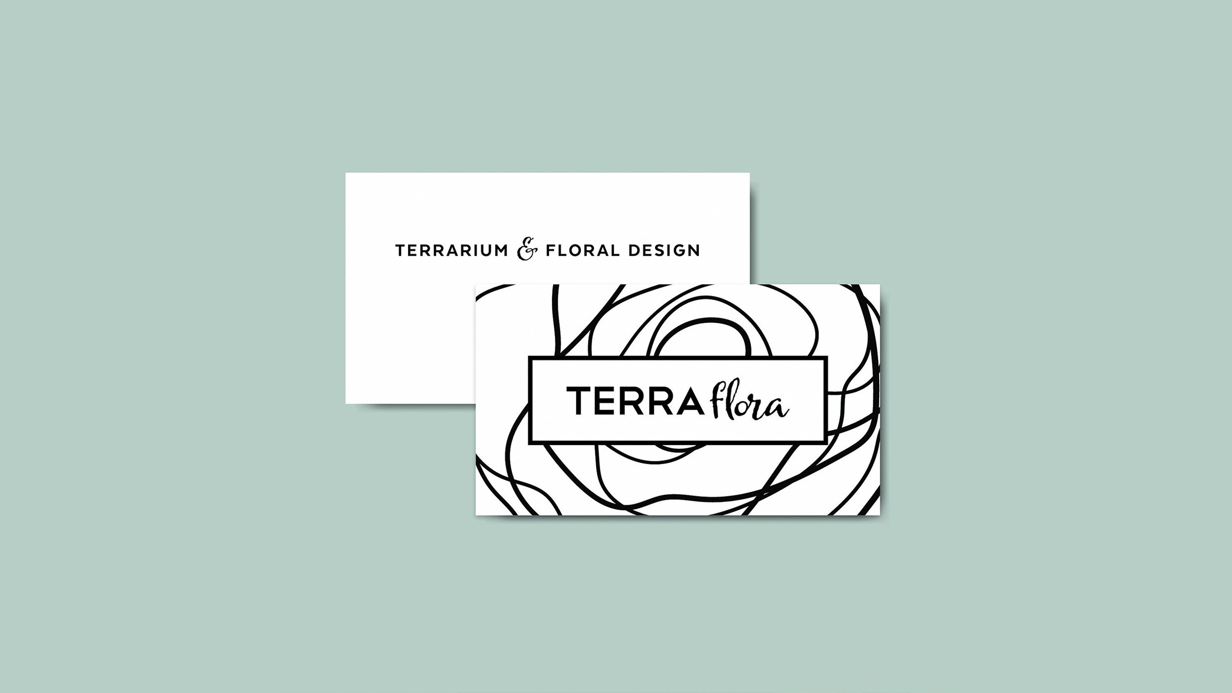
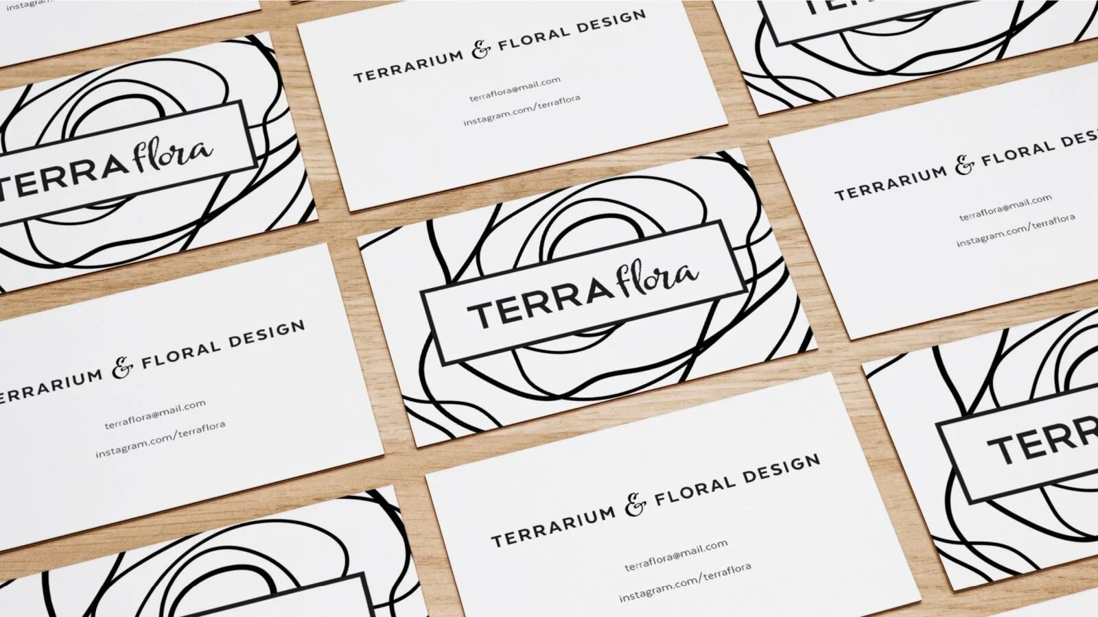
Terra Flora is a small independent business that sells terrarium arrangements across the Melbourne district. The client required the design of a logotype along with a business card and product swing tag to assist in the promotion of the business.
After discussion, it was made clear that the client was looking for a minimal, understated style that would provide visual contrast to the product whilst complimenting it.
The name was developed to be an abbreviation of terrain and floral; the focus was to convey the contrast between the structured formation of topography and the organic nature of botanics. The choice of a heavy sans typeface paired with a feminine brush script has played a key role in showing this. This contrast has also been extended through the incorporation of a minimalist illustration of a flower; clean lines in an organic formation.